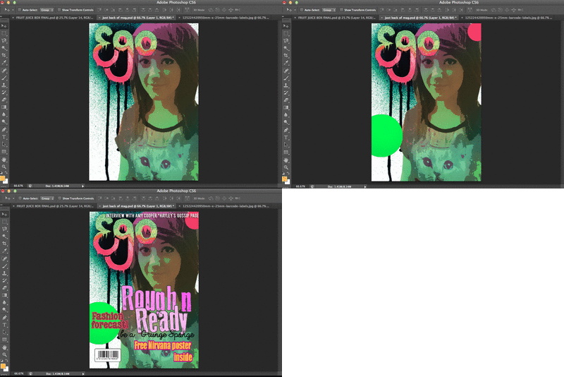
This was my final finished front cover for my magazine. I Decided to distort the colour of the background image to make the composition more interesting, and hopefully make it stand out more. I used green's and pink's because they contrast well and therefore make the cover seem more wacky and bold! I am pleased with my final piece because i think that the colours and font's used work really well.
Here is a short gif of some of the stages i went through to get to my final piece.


No comments:
Post a Comment